

TS TEAM
SCROLL DOWN
TS TEAM
An iconic bookstore needs an ecommerce microsite*
matthew valenti
Research
Information Architecture
UX Design
*This project was completed as part of the UXDI curriculum at General Assembly

TS CHALLANGE
TS CHALLANGE
Getting to know a brand
The Strand bookstore is a fabled brand with a strong cult following, however the disconnect between their online presence and the in-store experience was drastic. This disparity in brand identity was causing users to misunderstand very simple features of the ecommerce site, namely that one could buy products online. The challenge here was to dive deep into brand identity and design a curated microsite that expressed this clearly to three personas; the primary being a tech adverse senior.

TS THE USER
TS THE USER
Research conducted was primarily contextual analysis followed by in person interviews with long time Strand patrons. The following quotes represent the user identification with a brand they love as well as the disconnect in Strands online experience.
"Theres always a “Sal” type there. He’s old and bald and probably knew the author and the publisher. That guy personifies Strand."
"The Strand is a place where people who READ books go."
"I can't discover books on the website in a way that I can at the store."
"You can't buy these books online."

TS IA
TS IA
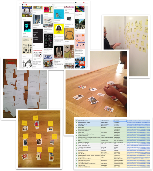
After identifying what the product inventory would be for the microsite, I took to affinity diagraming to find an initial filtering system. I tested this system with card sorting exercises - first with text only, and then, with the help of Pinterest, only book covers.

SITE MAP
SITE MAP
Using the results from the card sorting exercise the final navigation and filtering system was created. The structure consists of broad primary menu headers with detailed subcategories, product category and description pages, and a simple checkout flow.

TS WIRES
TS WIRES
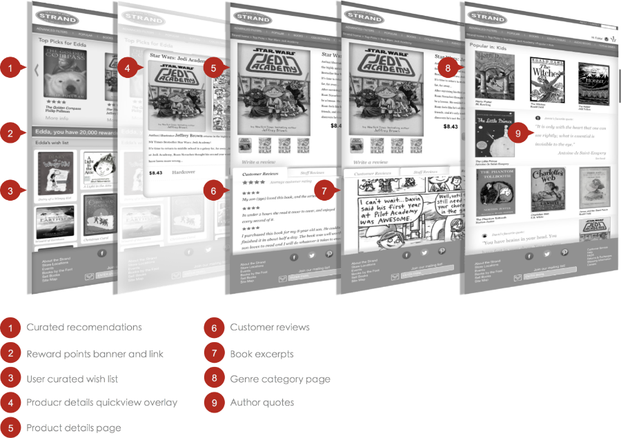
The wire framing process was the true test in bringing the look and feel of an analog brand to life in a digital experience. During initial testing I quickly realized the need for detailed product imagery and content to convey brand and gather the necessary data to refine flow and information hierarchy.

TS Flow
TS Flow
Through testing with wireframes, flows were created which demonstrate the behavior of three personas ranging in their interests and familiarity with technology. Identifying and mapping these behaviors aids in designing an easy path to checkout and highlights opportunities to up sell along the way.


